








25 Years
It’s our flois-anniversary! 2024 marks our 25th year practicing architecture in Seattle and the PNW. Join us as we celebrate this major milestone with a retrospective of defining projects. Each month, we’ll add additional years of our history to the timeline below. Stay tuned or follow us on Instagram for a deeper dive.
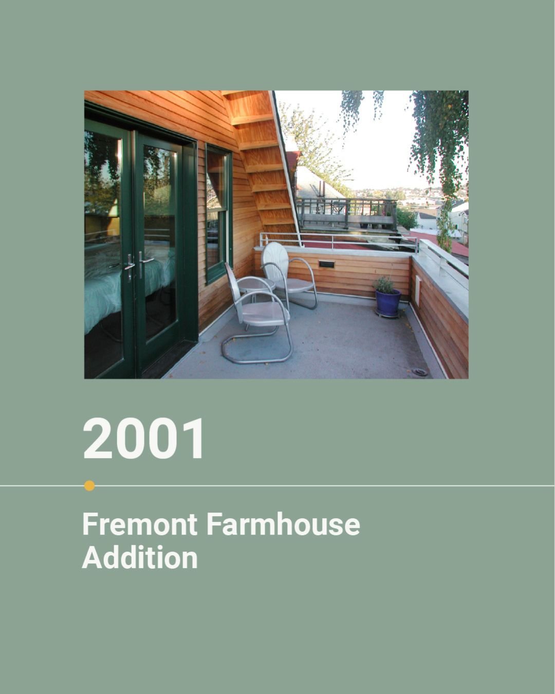
In 1999, our journey began - a young and ambitious architecture firm fueled by passion and a handful of trusting clients who believed in our vision. Back then, our clientele consisted mainly of supportive friends embarking on their own journeys, just like us. Our early projects, born out of budget-driven creativity, laid the foundation for Floisand Studio Architects. We’ve selected a few projects from each time period that illustrate milestones for our evolving firm. We crafted unique details: bent plate steel stairs, curvy handrails, bespoke light designs, and a barrel-vaulted roof – each element a testament to our dedication to design excellence.
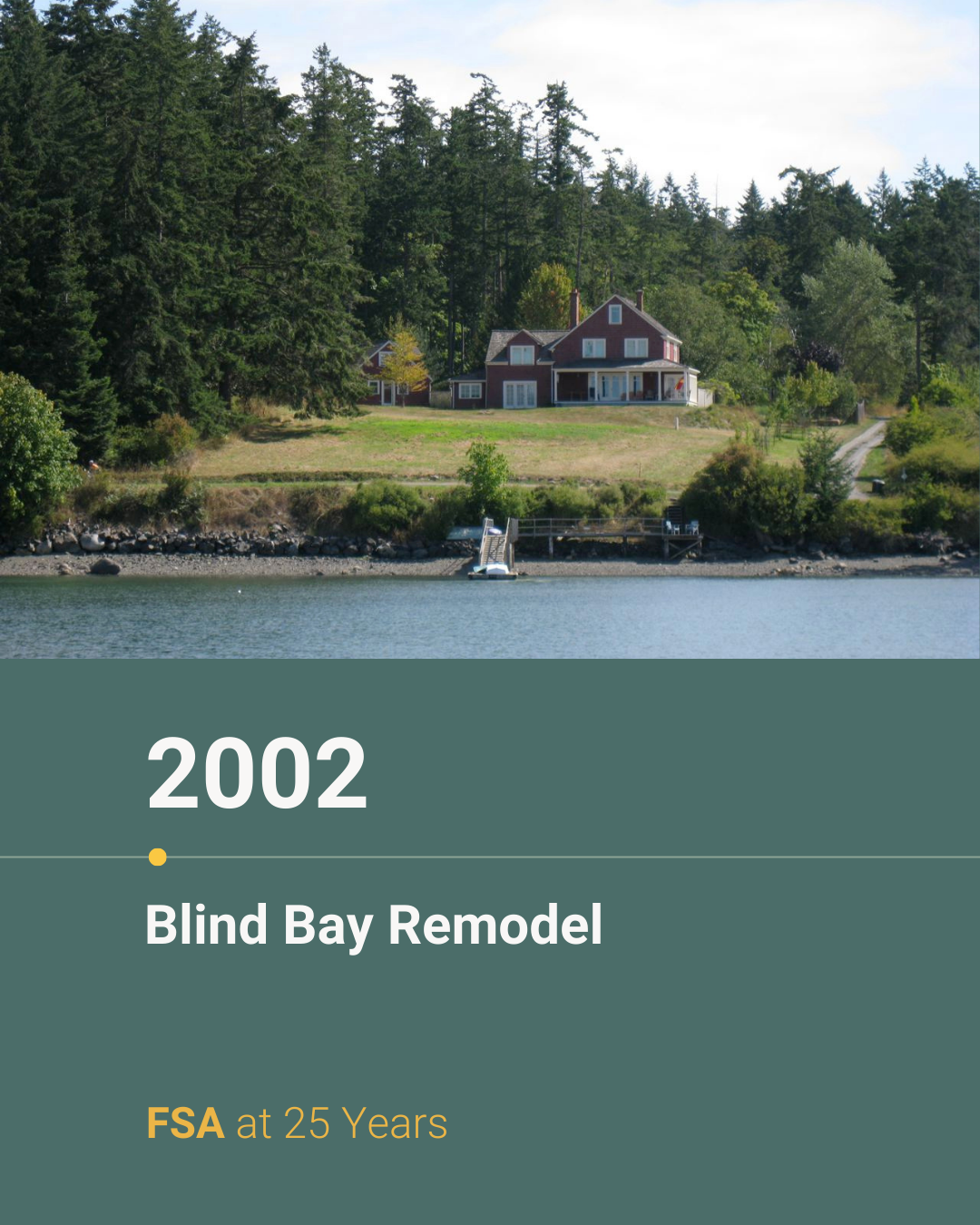
Rewinding to year 4 of 25: 2002. Reflecting on our rehabilitation of a 1903 farmhouse on a 2 ½ acre residential compound in Blind Bay, Shaw Island. The original house was moved from Bainbridge Island to Shaw by boat in the 1940s. This remodel holds a special place in our hearts as it not only marked a milestone for our young firm due to its historical value, unique location, and scope but also served as the site where Richard and Allison exchanged their vows.
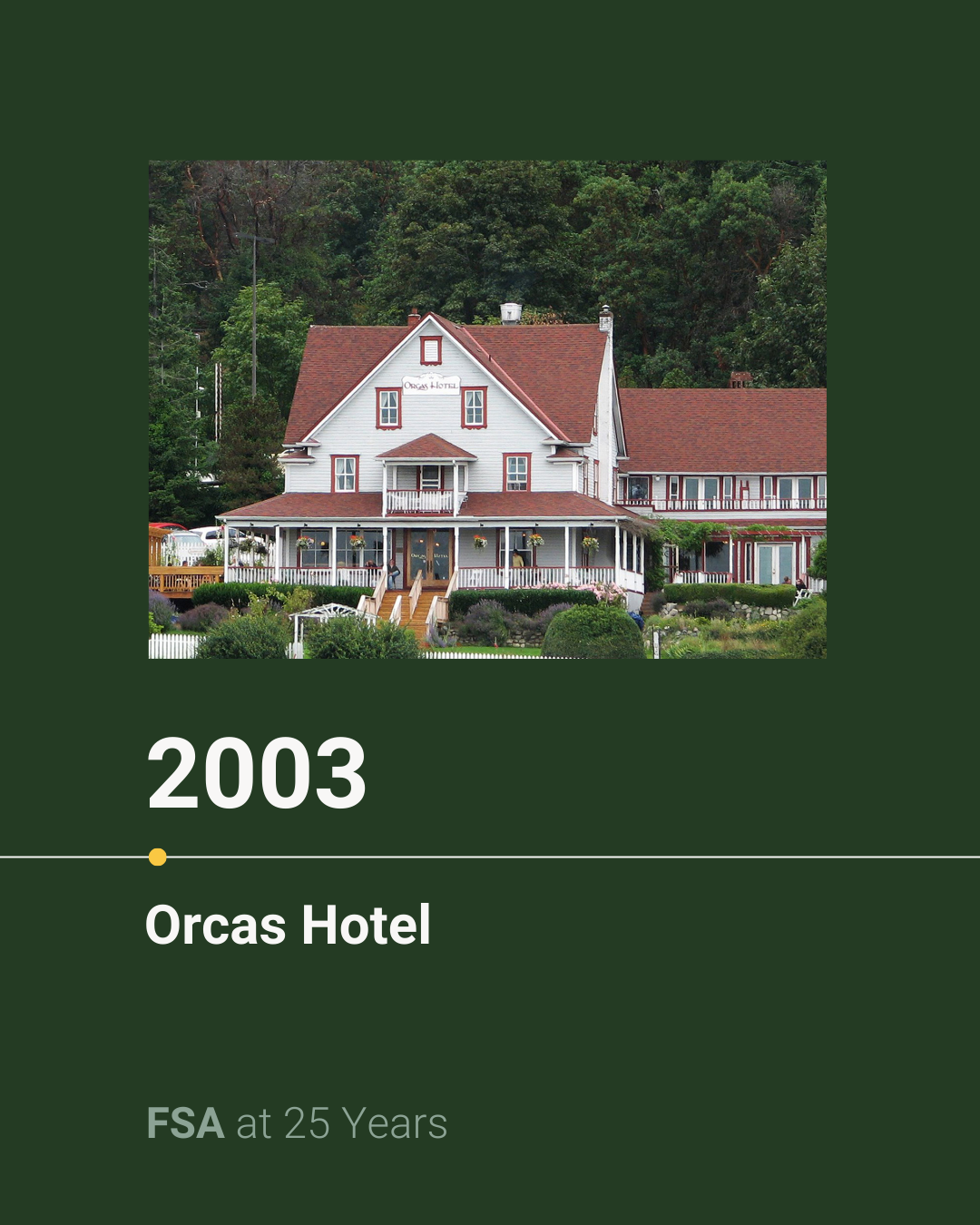
Rewinding to year 5 of 25: 2003. Our Orcas Hotel project was born out of serendipity, sparked by Richard and Allison’s rehearsal dinner held at the hotel the year prior. We embarked on the thoughtful rehabilitation of the quaint 1904 hotel on Orcas Island including a kitchen and dining room remodel, master planning for new guestroom bathrooms and reimagining main floor areas while preserving the hotel's rich history, architectural charm, and territorial views of the San Juan Islands.
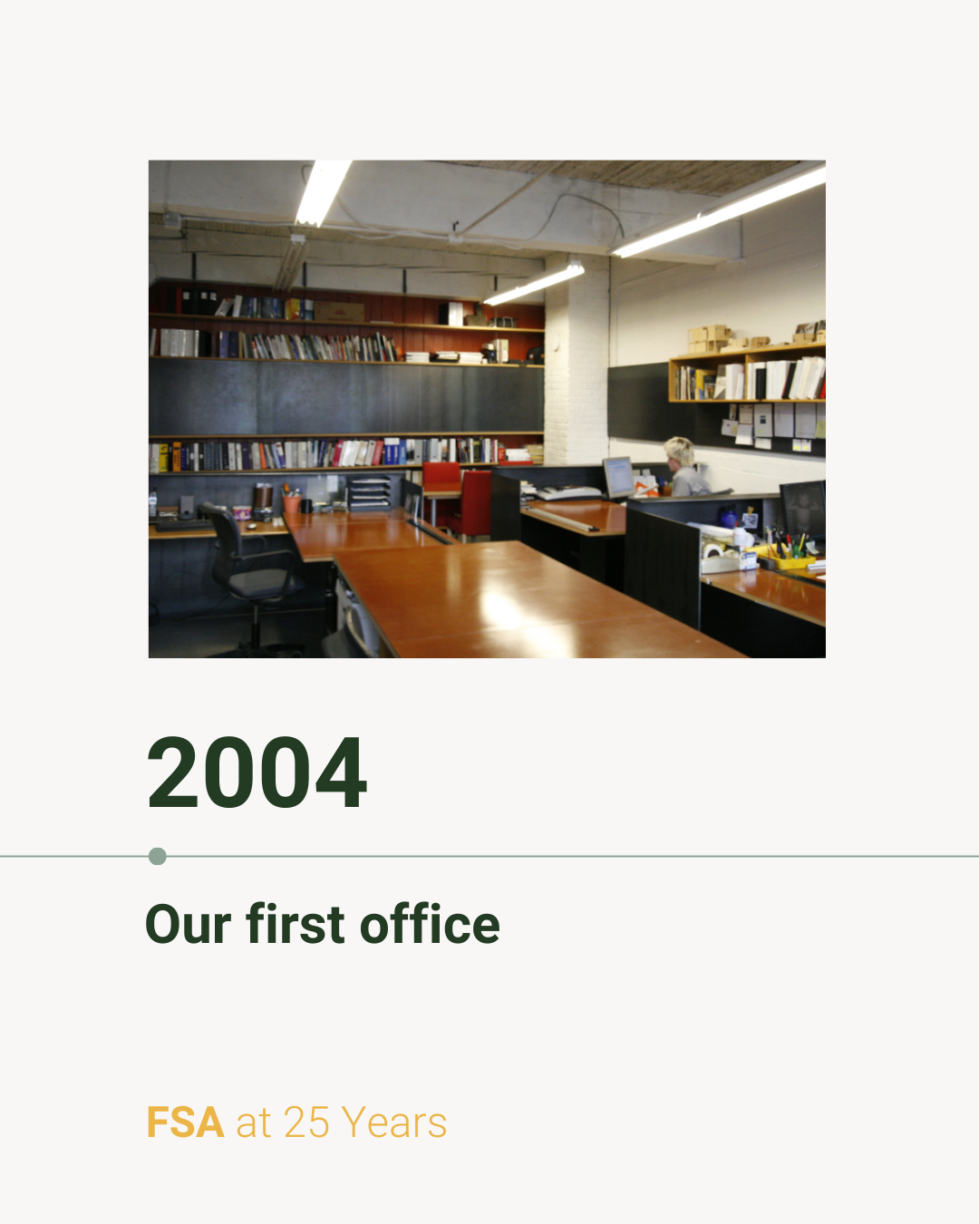
Rewinding to year 6 of 25: 2004. We moved into our first office in the 1910 Weleno Cork Insulation building in Seattle’s SODO neighborhood. Inspired by the building’s industrial past, we designed and built all of the furniture in the space, including the bent metal plate desks and sliding steel panel storage. We also officially welcomed Allison to the team after years offering input behind the scenes.
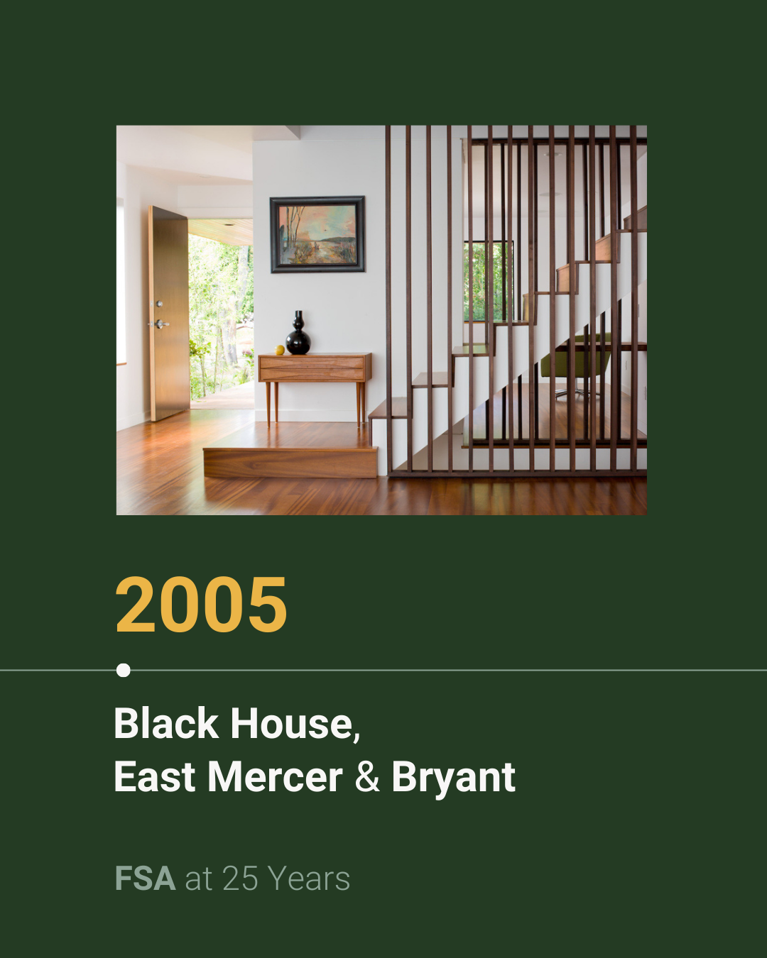
Rewinding to year 7 of 25: 2005. We embarked on a myriad of residential projects, each of which had unique scope and design challenges.
🏠 Black House: For our first new construction project, board-formed concrete walls bookend a cantilevering upper level that maximizes natural light and territorial views of south Seattle from the main living space. Principal Richard Floisand fabricated all of the structural steelwork for the project.
🏠 East Mercer: Located on Mercer Island, this project was “a puzzle of trees and light,” as Allison put it for the May 2011 issue of Northwest Home. Our team found inspiration in the surrounding landscape to overcome a number of site challenges resulting in a home that became one with the trees while balancing budget and design aspirations.
🏠 Bryant: Featured in the November 2007 issue of Seattle Magazine’s Shelter, our Bryant project is the story of a 1950s rambler we reimagined into a functional family home. The new upper story maximizes space while maintaining a low profile on the street and capitalizes on the light and views of Mount Rainier to the south.
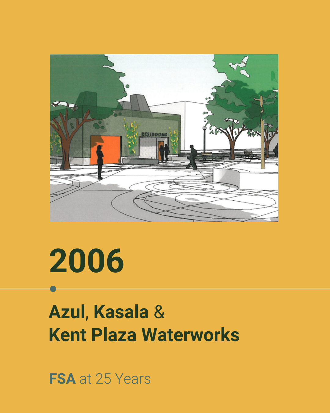
Rewinding to year 8 of 25: 2006. It was a year of firsts, as we took on a myriad of commercial project types including hospitality, retail, and public work.
🥑 Azul: At our first restaurant project, we aimed to strike a balance between Mexican culture and company ethos. The blue paneling seen on the exterior was inspired by the name, Azul, and is carried inside via a custom box display featuring candles and other treasures from Mexico. We also designed the custom light fixtures seen throughout the restaurant, which combine hard steel frame elements with the warm glow of a wood veneer.
🪑 Kasala: At our first retail project, we transformed a warehouse in Seattle’s SODO neighborhood into a retail space by inserting a structural steel moment frame into an existing concrete wall to create an inviting storefront.
🚰 Kent Plaza: At our first public works project, we aimed to design an approachable restroom for a public park using a combination of low-maintenance, easy-to-clean CMU block and geometric skylights that strategically focus natural light.
Rewinding to year 9 of 25: 2007. Our first Macrina Bakery location started our now 17-year partnership with the beloved Seattle bakery.
Located in the historic 1910 Weleno Cork Insulation building in Seattle’s SODO neighborhood, the original warehouse, featuring a blend of concrete and timber frame construction, underwent a substantial renovation to accommodate a café, commercial kitchen, production baking facility, and office spaces. We also designed the signage and retail displays for baked goods seen throughout the bakery.
Since designing the SODO location, which happens to be in the same building as our office, we’ve designed five more locations throughout the city, along with a 40,000 sq ft production facility in Kent.
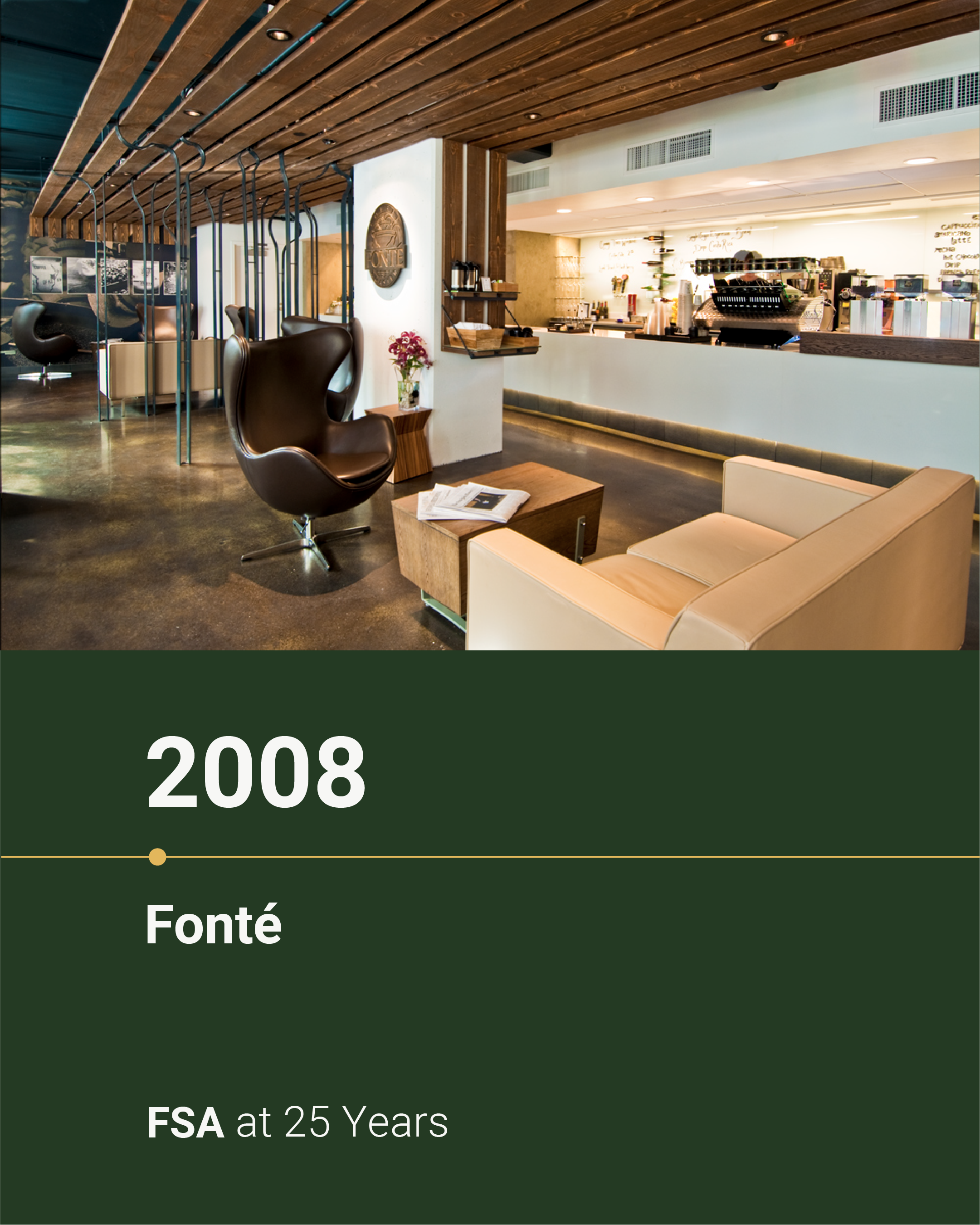
Rewinding to year 10 of 25: 2008. The year we designed Fonté’s flagship store at the base of the Four Seasons Hotel in downtown Seattle. Despite the empty space’s low ceilings, exposed piping, and limited natural light, we saw potential.
Rough sawn cedar runs the length of the ceiling, hiding utilities while adding an element of warmth to balance the concrete floor. A well-lit bar reflects the light from the front windows, inviting guests to step forward through the curvy steel columns that frame the service counter.
Rewinding to year 11 of 25: 2009. The year we had the honor of designing three different houses each in a distinct style to match our clients’ hopes and dreams—and, of course, budgets.
🏠 TEH: Recognized by @aiaseattle as a Home of Distinction, this was a custom house—from the “cloffice” (closet office) that accommodates the busy schedule of a neurosurgeon and ophthalmologist to the multi-purpose basement that serves as a mother-in-law suite, kids’ play area, media room, and art room.
🏠 West Mercer: The story of a simple kitchen remodel that snowballed into a complete overhaul. By strategically negotiating the original 1970s floor plan, we created a contemporary yet traditional family home.
🏠 Vashon: A short ferry ride from Seattle, this gambrel-roofed-barn-turned-home is tucked among quiet hazelnut orchards. Inside, it’s awash with color, a reflection of its vibrant owner who just so happens to be the founder of @MacrinaBakery. Naturally, the kitchen is the crown jewel.
.Rewinding to year 12 of 25: 2010. The year we embarked on our 17-year-and-counting partnership with Pagliacci Pizza.
We repurposed a 1950’s brick building—formerly an optometrist’s office—into an inviting pizzeria. Custom solar shading devices fashioned from rusted steel louvers filter the sun, providing ample natural light while reducing heat gain.
Since designing the Pagliacci Main Street location, we’ve designed 25 other Pagliacci restaurants in the greater Seattle area—each of which is distinct.
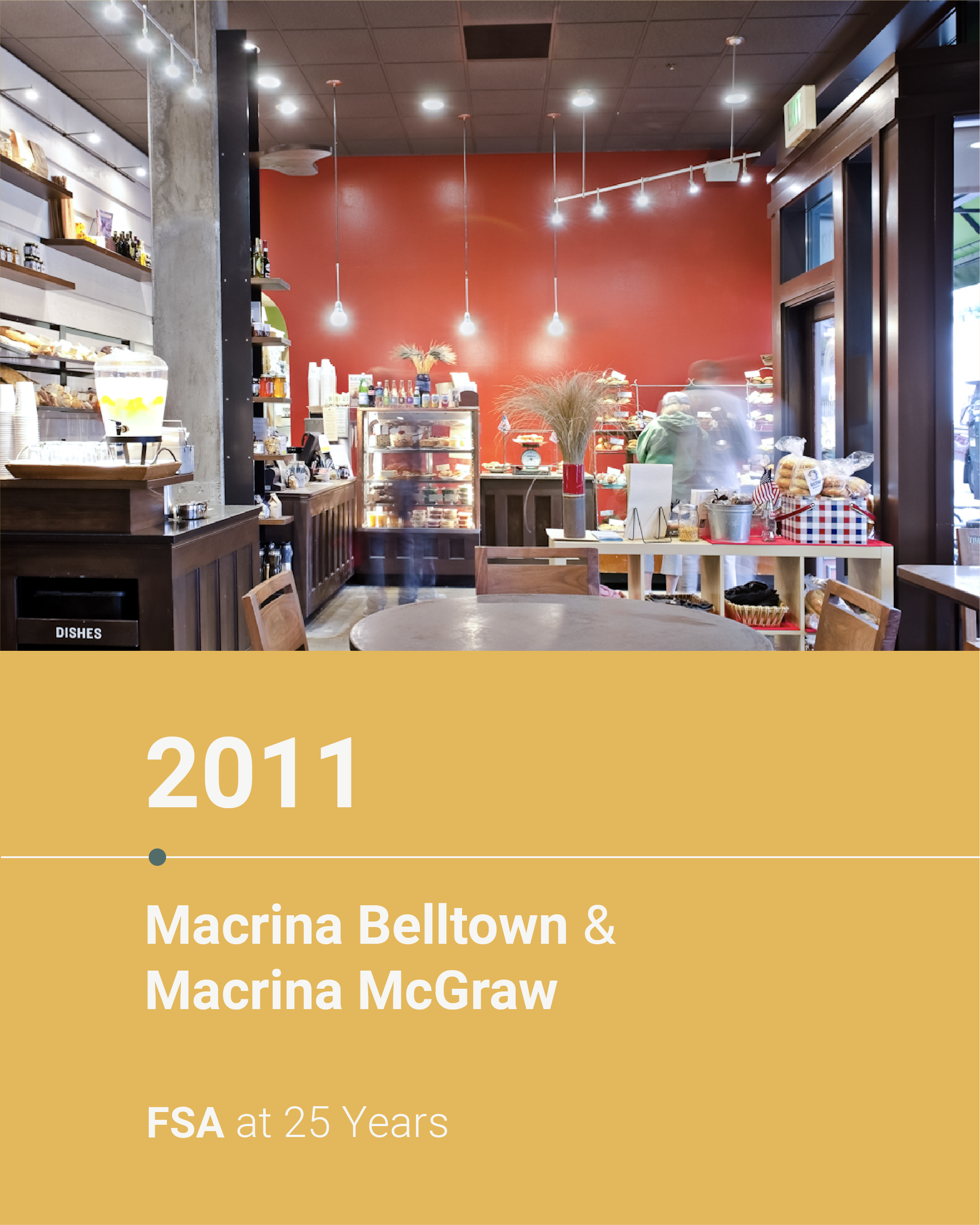
Rewinding to year 13 of 25: 2011. The year we expanded our partnership with Seattle’s beloved @macrinabakery to update two of their cafés located in the Belltown and Queen Anne neighborhoods.
We transformed these existing cafés with custom finishes, including product displays and signage, paired with new casework, furniture, and lighting.
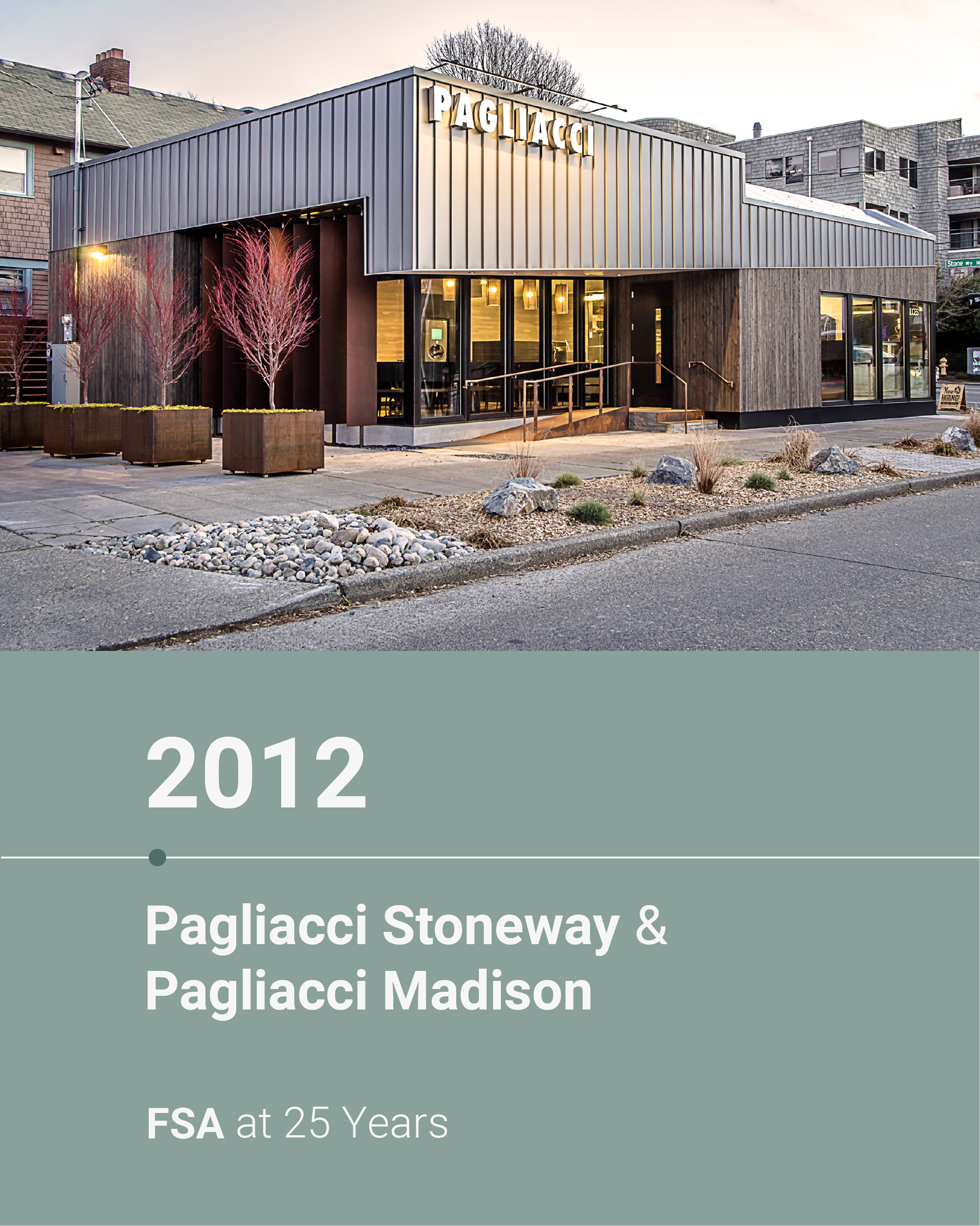
Rewinding to year 14 of 25: 2012. As @pagliaccipizza expanded in the Seattle area, so did our partnership with them.
We transformed their Stoneway delivery kitchen into a full restaurant, completing an expansion into the adjacent space where a two-story duplex stood. Strategic planning ensured the kitchen could continue operating during the entirety of the renovation.
The Madison pizzeria was groundbreaking in more ways than one. Not only was it our first new construction project for Pagliacci, but it became Seattle’s first stand-alone pizzeria to receive a LEED Gold certification.
Rewinding to year 15 of 25: 2013. The year we constructed a custom house to realize our clients’ dream of a soothing escape overlooking Puget Sound.
Named an Editor’s Pick in @homeadore, the completed project spans three floors and leverages the sloped lot and an open concept to maximize views of the water and Olympic Mountains.
Rewinding to year 16 of 25: 2014. The year we expanded our commercial portfolio with new and old partners.
Between 2014 and 2016, we completed 16 projects with @pagliaccipizza, including their Sandpoint, West Seattle, Mercer Island, and Columbia City locations. We also continued our partnership with @macrinabakery, helping to convert a warehouse into a production facility to supply their Seattle-area bakeries. We embarked on two new partnerships with Caffe Umbria, a European café, and Gelatiamo, an artisan gelato and pastry shop.
Our designs embody each brand, emphasizing features and layouts that support a positive guest experience.
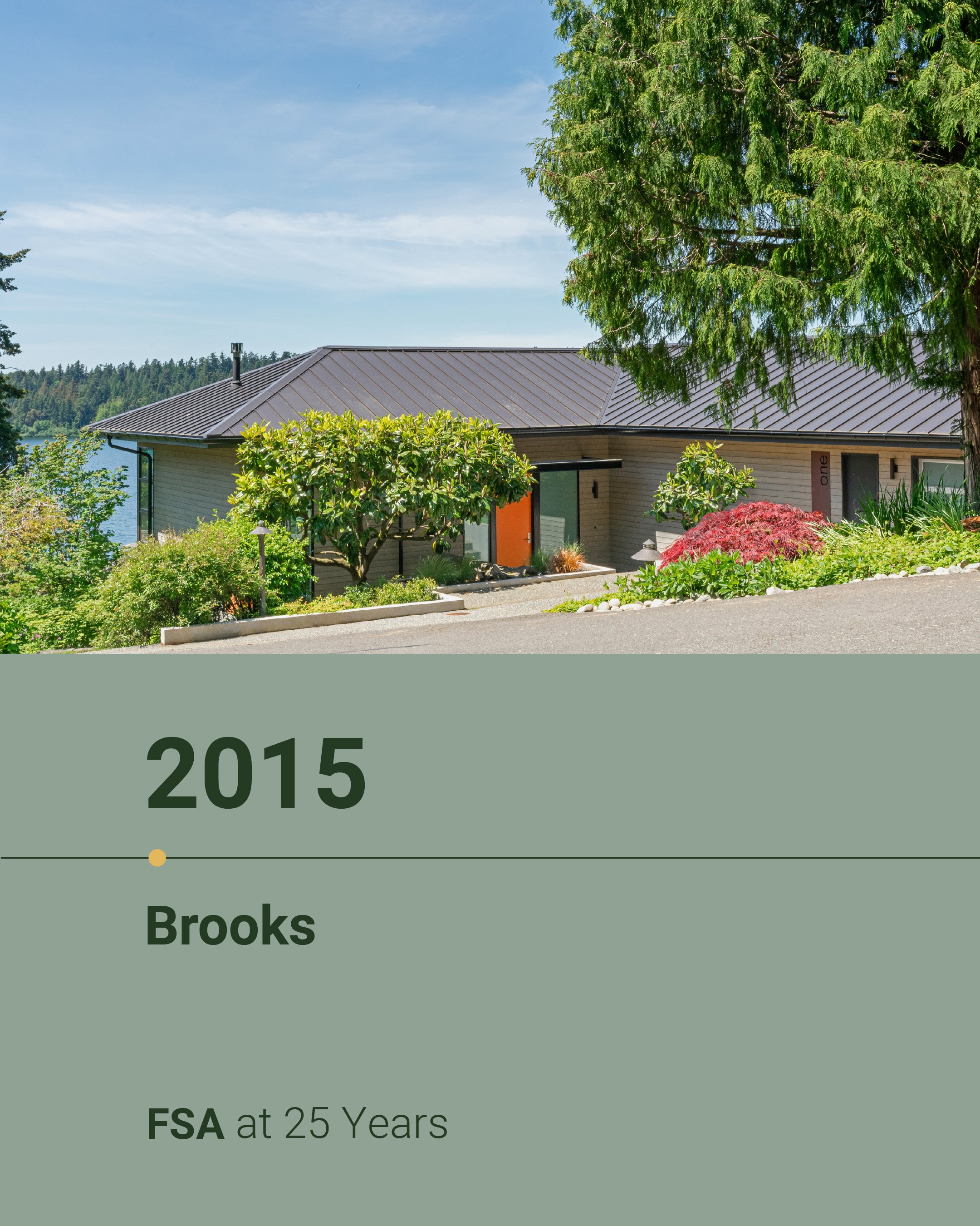
Rewinding to year 17 of 25: 2015. The year we worked with previous clients to transform a dated house on Mercer Island into a bright and open space recognized as an Editor’s Pick on @dwellmagazine.
The @seattletimes’ Sandy Deneau Dunham wrote of the project: “After Hogue and Granite Mountain Builders heroically gutted and remodeled every room (except the garage and master bathroom), the family’s beautiful home looks and feels a lot like happily ever after . . . a whole new world of connections—to the outdoors, to sunlight, to water, to a community.”
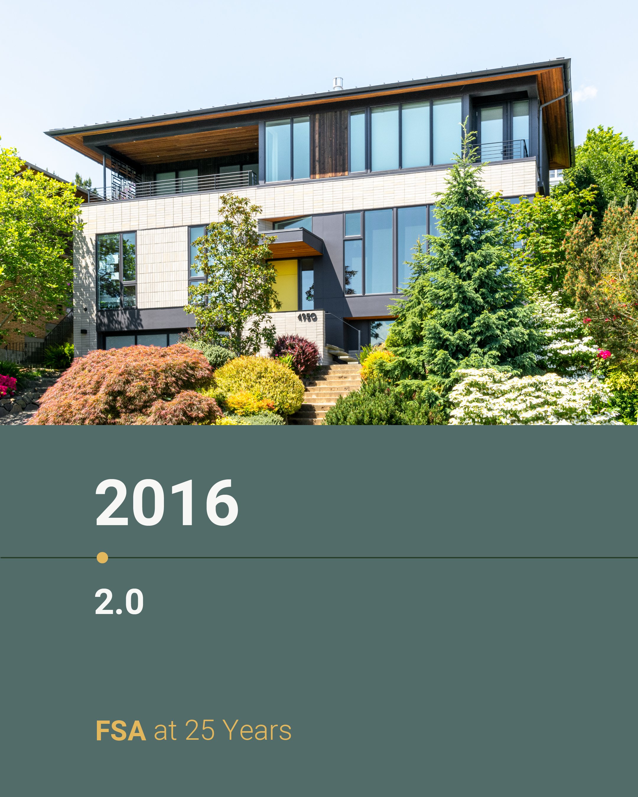
Rewinding to year 18 of 25: 2016. The year we remodeled an awkward 1960s home to fit a family of five with mid-century modern tastes.
We removed interior walls and introduced floor-to-ceiling windows on the main floor, augmenting the living space. The primary bedroom was relocated from the bottom floor to the new third story.
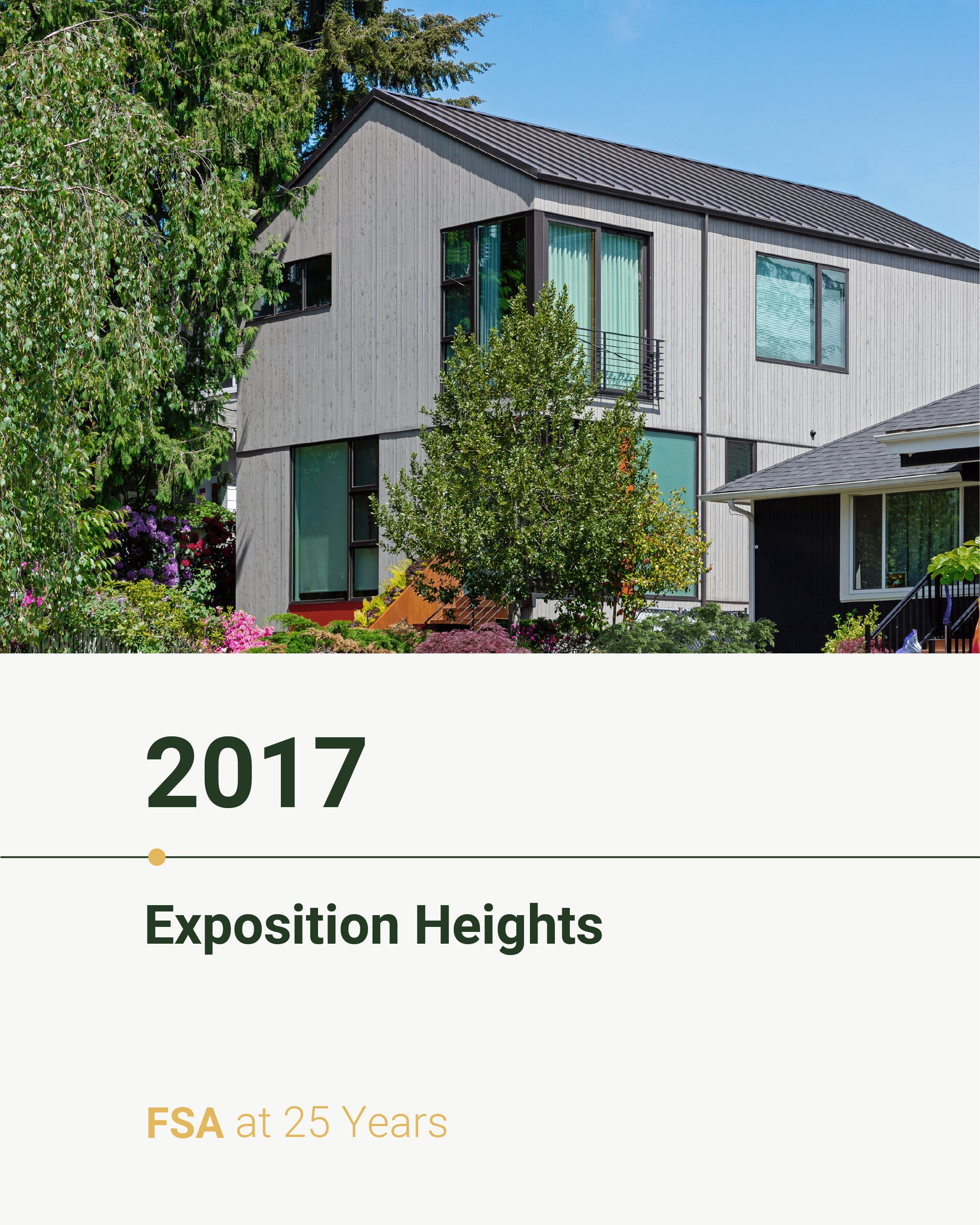
Rewinding to year 19 of 25: 2017. The year we transformed a 1960s home into a modern house for a growing family.
The primary challenge of the Exposition Heights project was the narrow lot size. By adding a second story, we doubled the home's size and optimized the original layout to maximize space. Open living areas and creative planning, including the idea for a desk tucked into the niche of the main stair, enhance functionality, while elements like undulating wood screens and clerestory windows add a contemporary design touch.
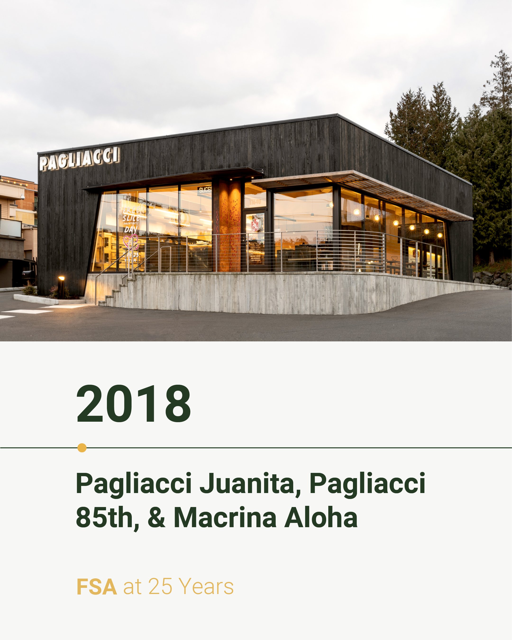
Rewinding to year 20 of 25: 2018. The year we completed three adaptive reuse projects for our commercial partners, @pagliaccipizza and @macrinabakery.
📍 Pagliacci Juanita
Pagliacci Pizza’s Juanita location underwent an 800 square foot expansion and a comprehensive remodel, featuring floor-to-ceiling windows, integrated canopies, custom lit signage, and revamped interiors with built-in bench seating and a communal standing bar.
📍 Pagliacci 85th Street
Our redesign of this location involved a complete overhaul to address an aging foundation and add 450 additional square feet. We introduced new floor-to-ceiling windows, exposed the original roof structure, and crafted custom wood and steel furnishings, along with exterior signage and lighting by local firm Resolute. The project updated all systems to meet modern energy and building standards, all while ensuring the store remained open throughout construction.
📍 Macrina Bakery Aloha
Our redesign of this neighborhood bakery merges historic charm with modern elegance. We repurposed the building’s idiosyncrasies to serve as a memorable backdrop. The original 1925 heavy timber is a focal point throughout the space. Modern finishes, like shiny brass accents, seamless marble countertops, and custom lighting, bridge the old and new.
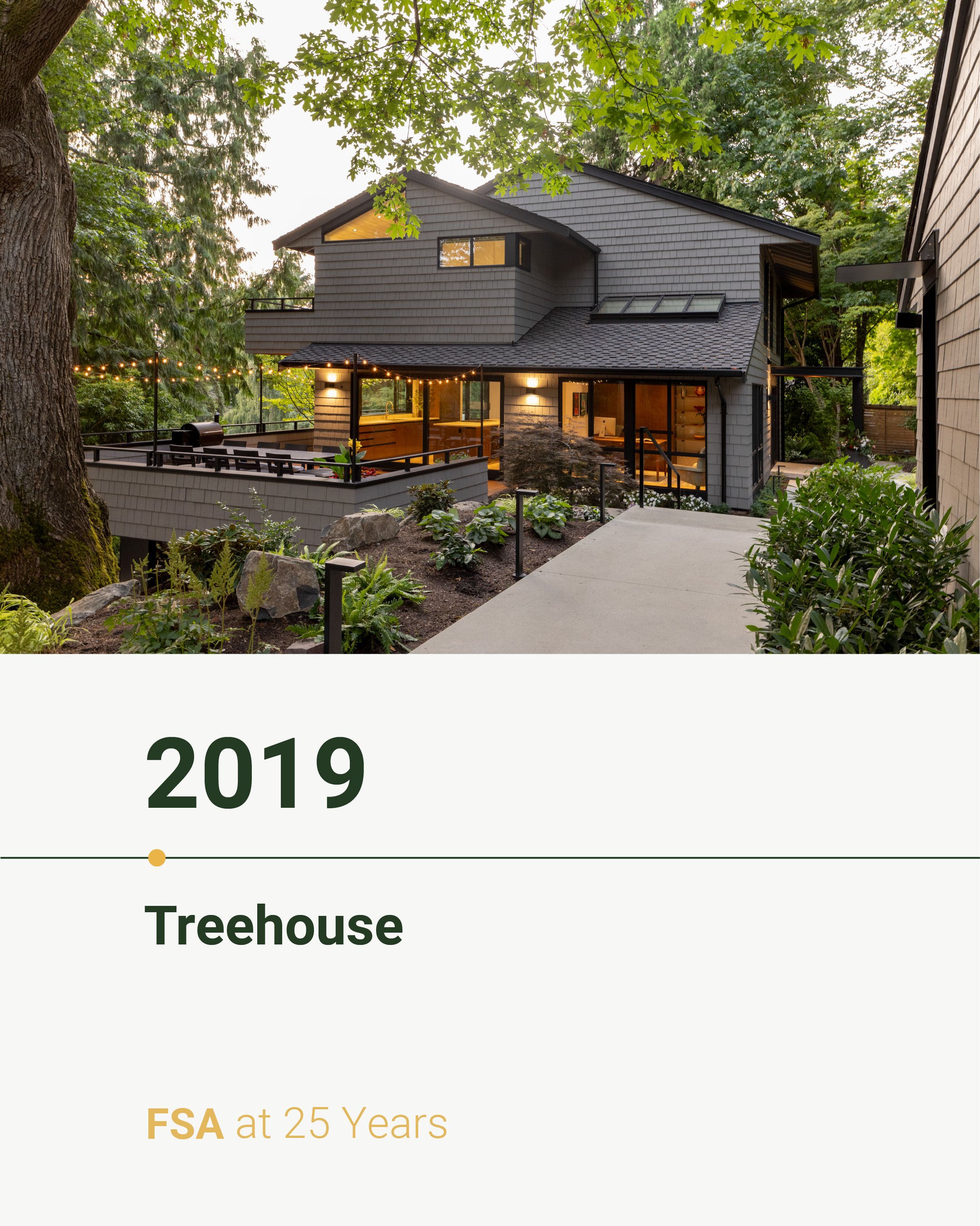
Rewinding to year 21 of 25: 2019. The year we renovated our Treehouse project, nestled among the Mercer Island trees.
Recognized as the AIA 2023 Home of Distinction, this project modernized a 70’s-era Black and Caldwell spec home, preserving its beloved features while creating fresh, functional spaces. New hardscaping, steel planters, and landscape walls enhance the entrance, while the reconfigured interior maximizes flow and connects living spaces to the outdoors. The master suite was updated with a walk-in closet, ensuite bath, and a west-facing deck.
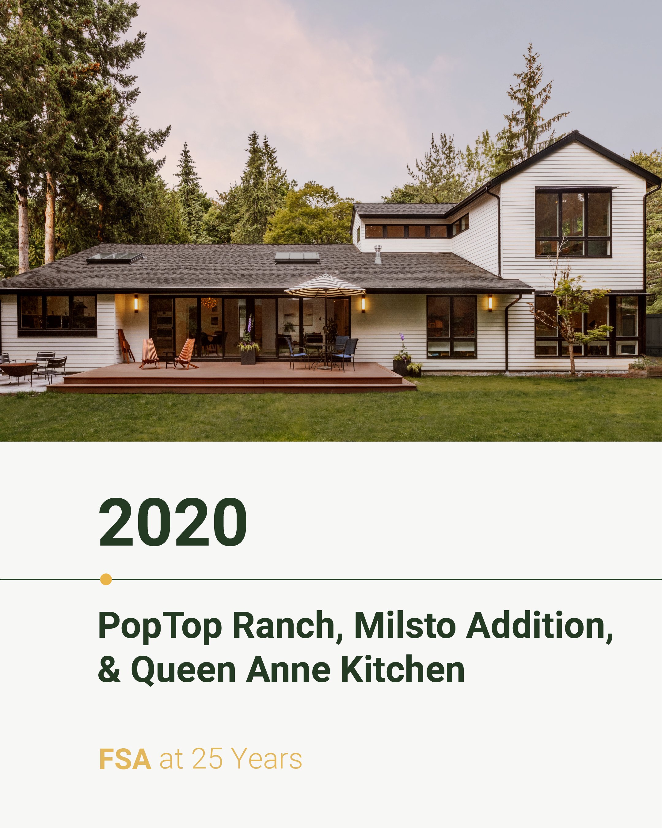
Rewinding to year 22 of 25: 2020. As COVID confined us to our homes, it prompted a deeper reflection on how our living spaces could more effectively meet our needs. Naturally, our focus for the year became three residential remodels.
PopTop Ranch: Our remodel focused on maximizing natural light, enhancing the connection between indoor and outdoor spaces, and creating a seamless flow throughout the primary living areas.
Milsto: We expanded this 1950s home with an L-shaped volume to allow for a new primary suite. The addition seamlessly connects to the main house beneath a single-slope shed roof, preserving the structure’s mid-century vibe.
Queen Anne Kitchen: We helped our clients-turned-friends remodel their compact kitchen, prioritizing space efficiency and mid-century style.
Rewinding to year 23 of 25: 2021. A year defined by two commercial adaptive reuse projects.
Macrina Bakery Maple Leaf: We transformed a former office into an inviting retail bakery by removing interior walls and introducing a harmonious blend of traditional and modern design elements. We added a row of south-facing windows to bathe the space in natural light.
Pagliacci Pizza Silsul: Built in 1939 as a Native American curio shop and later a restaurant, this building is a heavy timber replica of a six-beam Haida house. With the support of @headwaterpeopleconsulting, we worked to preserve the structure, adding a complementary timber addition that pays homage to its roots and accommodates Pagliacci’s needs.
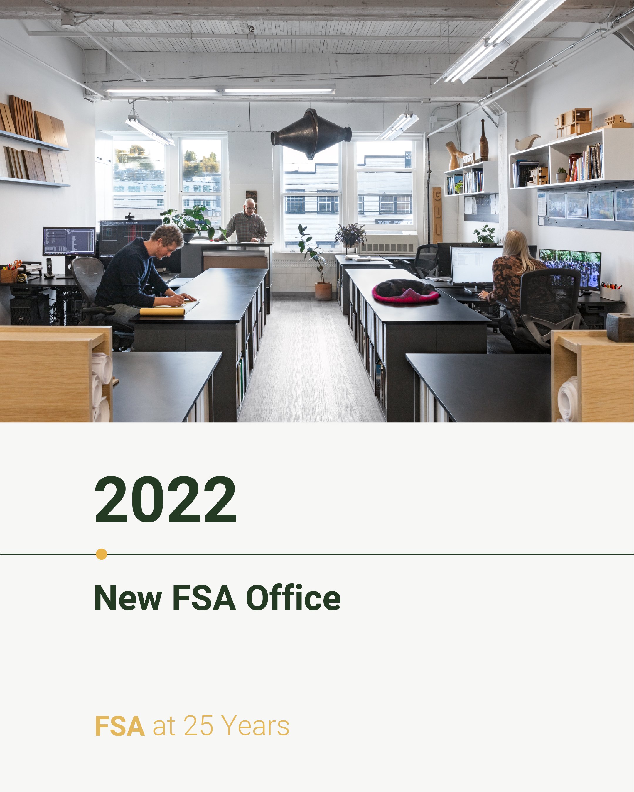
Rewinding to year 24 of 25: 2022.The year we built out our new office to accommodate our growing firm.
Since 2004, we’ve called the historic Weleno Cork Insulation Building in Seattle’s SoDo neighborhood home. In 2022, we moved to a larger space within the building, seizing the opportunity to design a custom office with white oak cabinetry, abundant natural light, and a blend of modern and natural elements that honor the building's original character.
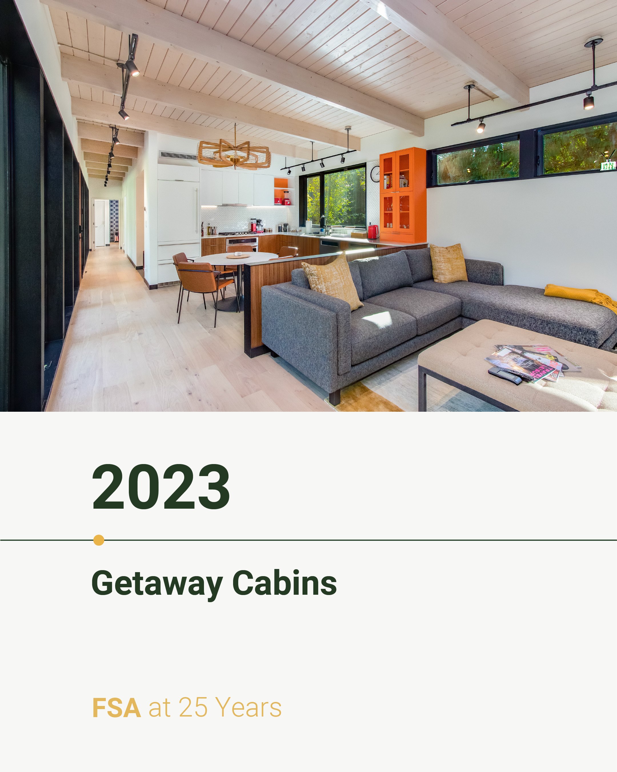
Rewinding to year 24 of 25: 2023. The year we designed two Getaway Cabins in Packwood, Washington.
The 1,000 SF precision-engineered modular homes were designed for comfort and functionality. Featuring energy-efficient windows and exposed timber frame ceilings, these cabins seamlessly blend indoor and outdoor living.
Designed in Seattle and built in a factory in Monroe, these two-bedroom, prefab cabins can be transported fully assembled and bolted down to a site-built foundation. With a width of just over 16’, we designed them to fit seamlessly on various lot sizes and configurations.
And that brings us to 2024—our 25th year as an architecture firm! This year, we completed two projects for our friends at Pagliacci Pizza, including the construction of the new Eastgate location and remodel of the Edmonds location.
The Pagliacci Eastgate design draws inspiration from its unique neighborhood context, featuring large backlit polycarbonate panels that create a lantern effect, inviting customers in from the busy surroundings. The light and colorful interiors, with cushioned seating and white oak cabinets, contrast the black wood and metal exterior.
We remodeled the freestanding Edmonds location, originally built in the 80s, to enhance efficiency and the customer experience. Updates include additional seating, a larger slice bar, a grab-and-go beverage cooler, and custom geometric pendants that complement the store's abundant natural light and angled windows.
